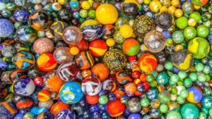
Colour is an important part of marketing. It takes someone 90 seconds to make a judgement on a product and up to 90% of it is based on colour alone. This statistic shows just how important colour can be, so getting the colour wrong can have catastrophic effects.
The current problem is that there’s no fixed formula to provide a solution. There’s no guide to using colour in Marketing. This provides headache after headache for marketers trying to up sales, spread the word and reach new customers. This blog post explores the best way to use colour in your marketing.
Colour has always been linked to emotion:
- Black – authority, power and professionalism
- Blue – loyalty, respect, dependability, trust, strength
- Brown – stability, harvest, traditional, strength, simplicity
- Green – wealth, superiority, natural/nature-orientated, sophistication, serenity
- Grey – death, taxes, depression
- Orange – ostentatious, showy, ambition, new attitude, cheerful, forward-thinking, confident
- Pink – femininity feelings of playfulness, romanticism
- Purple – majestic, royal, rich, mystery, creativity, uniqueness, be different
- Red – movement, excitement, action, urgency, dominant
- White – purity, safety, neutral
- Yellow – happiness, sanguinity, optimism, warmth, positivity.
You may have seen these associations before. The important question here is how applicable do you think it is to everyday life? Have a look at these logos:
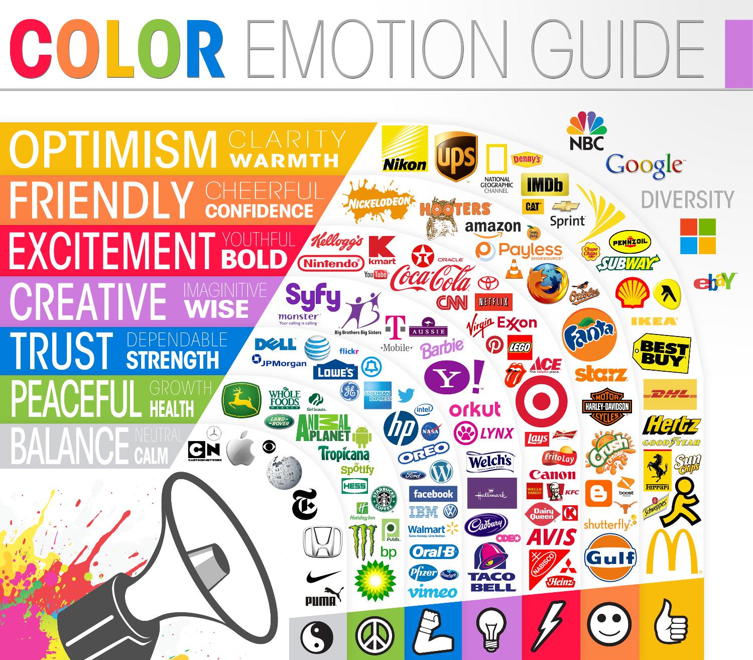
Do you think Oreo gives a sense of respect and dependability because their logo is blue? How about a feeling of wealth and superiority associated with Monster Energy Drink?
A lot of research has been poured into how colours are related to different emotions but do we really create these associations? Perhaps sub-consciously we do.
Unfortunately, after extensive research it turns out that colour emotion is all about personal preference1. So it turns out that our experiences, upbringings, cultural differences and context will all affect how we perceive colour. The result: colour is too dependable on personal experiences to be universally translated into specific feelings.
So if you can’t rely on a standard colour chart, what can you do? The answer is simple – think of your customer. Predicting customer reactions to colour is going to be much more effective and more important than the colour itself. VLC Media player may not have chosen orange as their logo colour because they wanted to be ostentatious and showy but because the image of a traffic cone was much more appropriate and appealing to their customers. Changing the colour to something more representational of their brand would have potentially caused a negative reaction from customers.
The relationship between brands and colour is hinged on the perceived appropriateness from their customers. In a modern world where customers crave personalised experiences, it’s critically important to ensure that a personality shines through. This could even go as far as to be different from the competitors. If Dell, HP, Intel and IBM all have blue logos then a new competitor in the field of technology may find that a red logo will work better in differentiating their brand from the rest.
It’s not just the logo that we need to consider. Colour on a webpage can be used carefully and artistically to have psychological control. Bright and vibrant colours will attract the eye, coupled with paler colours it becomes easy to direct customers to particular parts of your page. This is where it becomes important to create brand colours.


It probably didn’t take you long to associate these two images with Google. You might think it’s because one of the images has their company name and the other has their logo but more than likely the association formed much quicker than that based on the colour scheme alone. Google has a very distinguishable colour palette and uses it to the letter.
By creating a stock of primary colours used in your marketing you are able to allow easy association in everything you do. Apple Inc. is another great example of this:
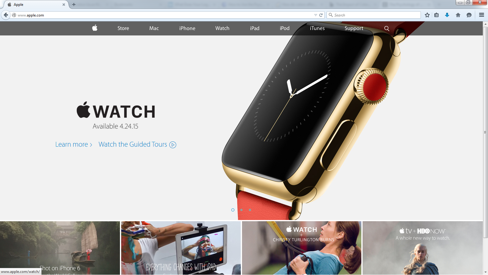
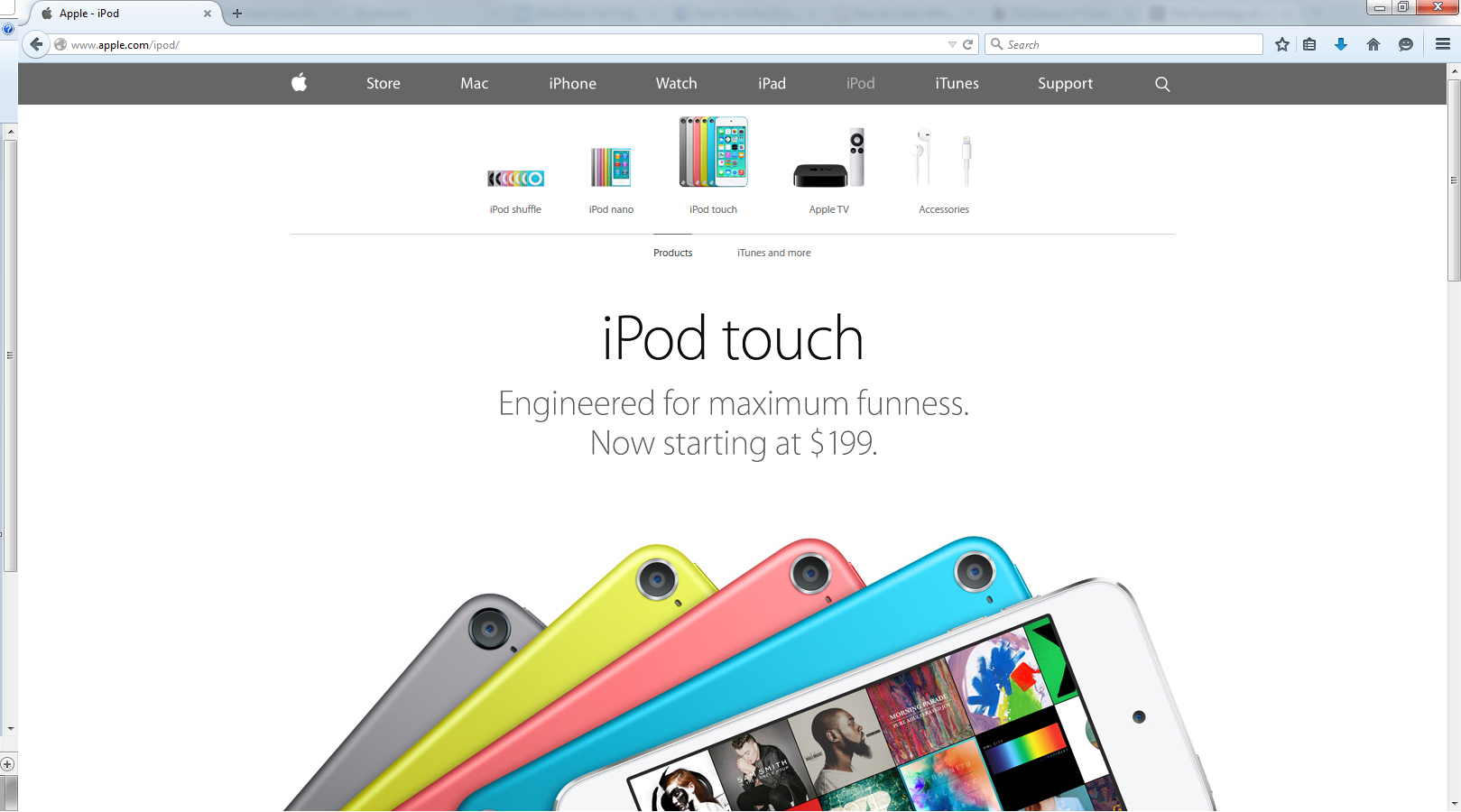
Visiting Apple’s website, you instantly know their product, branding and style. Their colour palette is broader in some respects but also minimalistic. More importantly, Apple take advantage of their colour splashes to show their personality in their products.
As you can see, colour and colour palettes play an essential role in marketing and have a larger impact on us than we realise. Choosing colours can potentially be the hardest part, but with consideration of personality and customer reaction, choosing the right colour in your branding and marketing campaigns can have an impressive impact.
1Colour emotion is all about personal preference – The Psychology of Colors in Marketing (Infographic) (digitalsynopsis.com)