
What are Call to Actions (CTA)?
Call to actions (often abbreviated to CTAs) are usually images or a line of text that prompts an individual viewing it to take a certain action, by clicking through. This action could range from downloading a whitepaper to signing up to a webinar and CTAs can be placed anywhere within marketing communications – in email marketing messages, at the end of blog posts or across entire websites.
A clear call to action can help you to maximise conversion, improve user experience, generate leads and increase your profits. By using CTAs you are able to effectively direct your visitor’s attention to a certain message, whilst developing a clear route for them to follow to accomplishing your goal. For example:
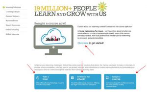
Skillsoft’s learning solutions page offers a number of different CTAs:

They’re easy to see and have clear purposes, which help to direct traffic through their site. Likewise, a page like this could be easily translated into an email marketing campaign, whereby the three individual call to actions could also be used to lead prospects through to those individual pages.
So how can we improve our CTAs?
There are a number of things you can do to help maximise your CTAs and by tweaking them slightly, you will be able to improve conversion rates and should see a higher percentage of people clicking through on websites, emails or other marketing campaigns. Here we discuss our top 6 tips to help you…
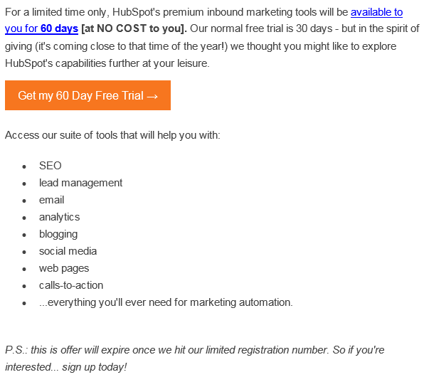
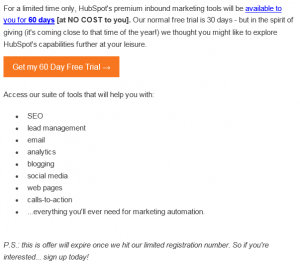
1. Write in action-orientated, second-person verbs
This is where writing ‘your’ or ‘my’ is going to be the most effective. In the HubSpot email marketing campaign example below, the main call to action is ‘Get my 60 Day Free Trial’ – giving the reader a sense of ownership of the trial and making it clear that they will personally have that at their disposal for the 60 days. This is the perfect example of including action-orientated verbs.
This call to action is also further supported by words that also demonstrate a sense of urgency too – “this offer will expire once we hit our limited registration number” – this, along with the word “my” adds a sense of competition against other people, re-affirming a person’s necessity to click on the call to action. This leads us on nicely to expert tip #2…
2. Create urgency
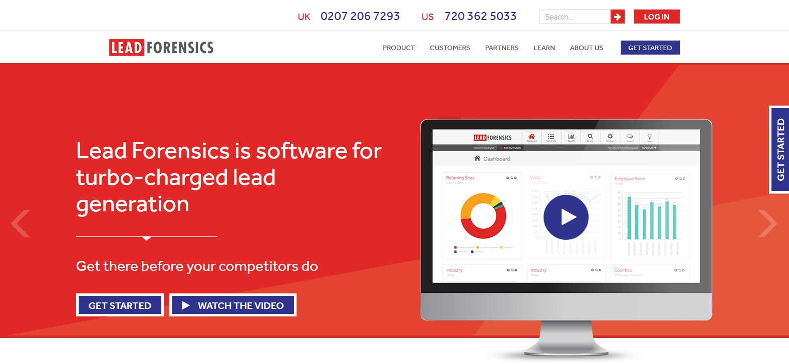
Using words such as ‘Download Now’ create a sense of urgency that visitors simply won’t be able to resist. Like the HubSpot example above, Lead Forensics’ also use the reference ‘Get there before your competitors do’, a tactic designed to install panic and gain that all important click on the ‘Get Started’ button.
3. Make the next steps clear
When visitors see your CTAs, they’ll want to know why they should click in the first place.
By telling your visitor how they can benefit, you can eliminate their questions – what can you offer? How are you different to your competitors? Are you going to be saving them time? By ensuring your message is clear and you communicate exactly what path they’ll be taken on, you should see a positive impact on clickthroughs, as well as a reduction in page abandonment after the initial click.
There won’t be any doubt what will come next. If it’s a ‘Download Now’ option, then your visitor will know they’ll be downloading. This way, you’ll be able to help their visitor journey move along without ruining their expectations.
Take a look at Silverpop’s website. Here it’s clear that the call to action will take the visitor to more information without leaving them to search for it on the website.

Silverpop provide a 24 word sentence that not only sums up that they do but provides a website visitor enough information to want to find out more about how their platform can help. And let’s not dismiss the bright, bold yellow button that they strategically place in front of a blue background. That brings us to our next point, design.
4. Tweak the design
Creating the perfect design may not necessarily happen overnight and will require careful planning and potentially some design tweaks. Let’s quickly revisit the four examples we’ve already seen:


You may have noticed that they all have one very important thing in common: contrasting colours. They all have a starkly contrasting colour scheme. By using such contrasts, the CTAs are easy to find and easy to distinguish. They immediately draw the eye to them.
When you’re tweaking your design and trying to find out what works best (in terms of positioning, shape, text etc.) it’s crucial to consider your colour scheme and ensure it’s easy to read with a clear, concise message.
5. Test, test, test.
The only way to check if your call to action works is to test it!
Trends come and go. So it’s important to keep trialling different versions of CTAs to find out what resonates with your audience and keep them interested with something different. It’s not a case of creating a CTA and thinking it’s finished. By refining your marketing activity, you should optimise your ROI.
Some elements of call to actions you can change or tweak are below:
- Copy
- Placement
- Design
- Text vs image
- The use of white space
- Colours
- What you’re offering.
- Static vs motion based
- Size
Make sure it aligns with your brand but don’t be afraid to experiment and see what works.
6. Use them everywhere
Call to actions and CTA testing should not just be restricted to the home page of your website. CTAs can be used to promote anything: whitepapers, webinars, registration or event information and they can come in all forms:
- Find out more
- Learn more
- Read this blog
- Download now
- Try our product
- Free trial
So adding them to all aspects of your marketing and trying out variations everywhere can help you design a user journey that ultimately leads to conversion.
By creating effective call to actions, marketers put themselves in a position where they are able to collect more intelligence and information about individuals showing an interest in your company, the products or services you offer, and the content you produce.
By following our six expert tips, you’ll be on your way to becoming the next CTA guru in no time.